Teleport
2024
Teleport Design System
Design library for Teleport products which consists a collection of reusable components, patterns and design guidelines that act as a single source of truth.

Overview
Why we came up with this initiative?
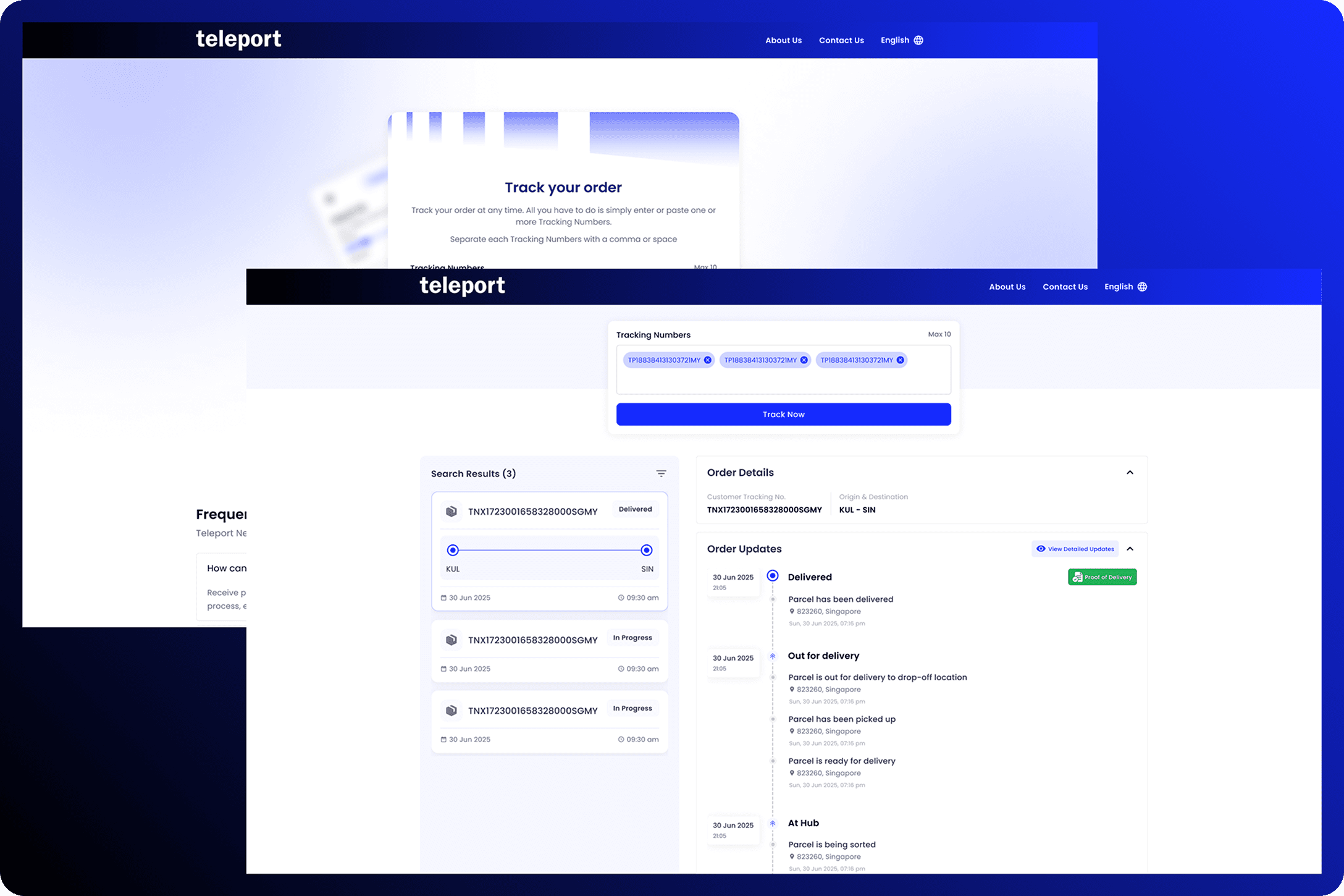
We’ve been relying on outdated design guidelines for quite some time across products like One Teleport and internal operations scanning app – which means our UI patterns are no longer aligned with current industry standards such as Material Design, MUI, and the Human Interface Guidelines. As a result, our design language feels inconsistent and behind modern expectations.
On top of that, we lack a proper, centralized toolkit and documentation system. Components were scattered across multiple files with no single source of truth, making it difficult for designers and developers to efficiently reference, reuse, and maintain them.
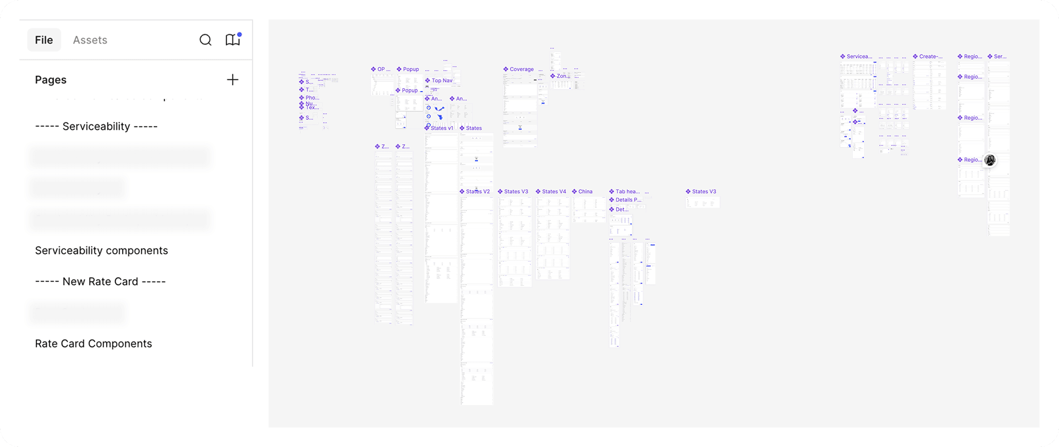
On top of that, we lack a proper, centralized toolkit and documentation system. Components were scattered across multiple files with no single source of truth, making it difficult for designers and developers to efficiently reference, reuse, and maintain them.
Design Process
How I approached this project?
Inspiration & Visual Guidelines
For inspiration, we looked at some UI kits samples from Figma community to get ideas on how to organize our design system and the list of components to be included. While working on the component library, we also referred Material Design 3 and Material UI (MUI) as our roadmap.
The Teleport branding looks and feels has been set by our internal marketing team therefore, elements like color, typography, logo, illustrations and some icons are maintained as what provided by the team.
Typography & Color Palette
While developing this design system, text styles and color styles was the first thing we created in Figma as it plays critical role for us to scale up for other components. We reviewed our previous branding guidelines and compared with the current one – then decide if there were any tweaks required.
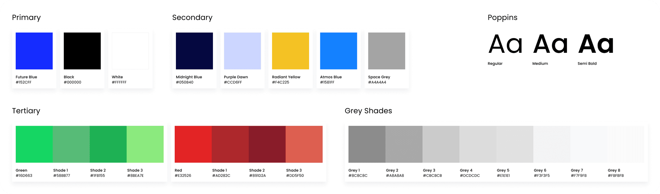
For typography, we maintained Poppins as our font however, we removed bold font weight to align with the current design guideline from our marketing team.
For colors, we reduced from 9 shades of system colors (success & errors) to 4 shades for each.
We defined and came up with colors specific for text, placeholder/subtext and icons.
Component Properties
Figma component properties are parameters that make components dynamic and customizable, reducing the need for numerous variants. They allow us to toggle layers, change text, and swap nested components directly within the instance panel. We utilize this function from Figma to improve our efficiency, organization and workflow.
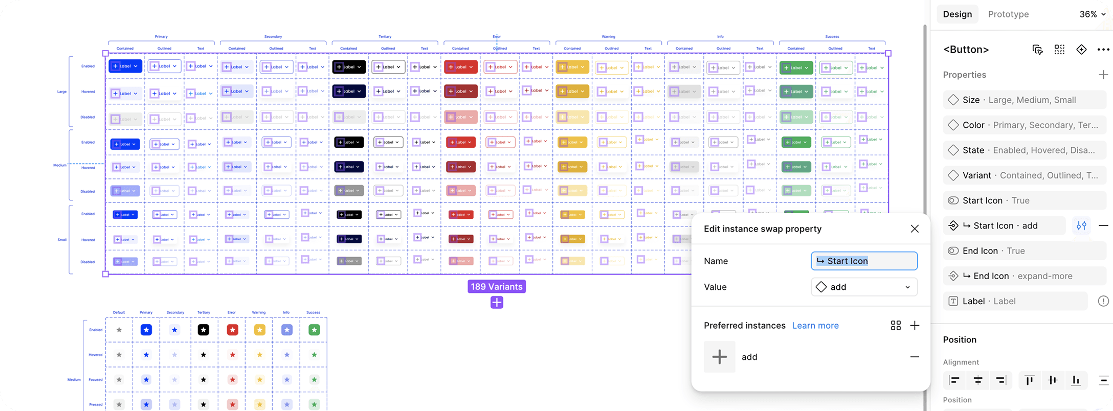
Boolean property was implemented to show or hide icons especially for our buttons, text fields, cards, headers and footers.
Instance swap property was used to change icons within nested components.
Variants such as sizes, colors and states were defined via Variant property.
Text property was used so that we can quickly change the label or description of the components.
Task Organization & Timeline
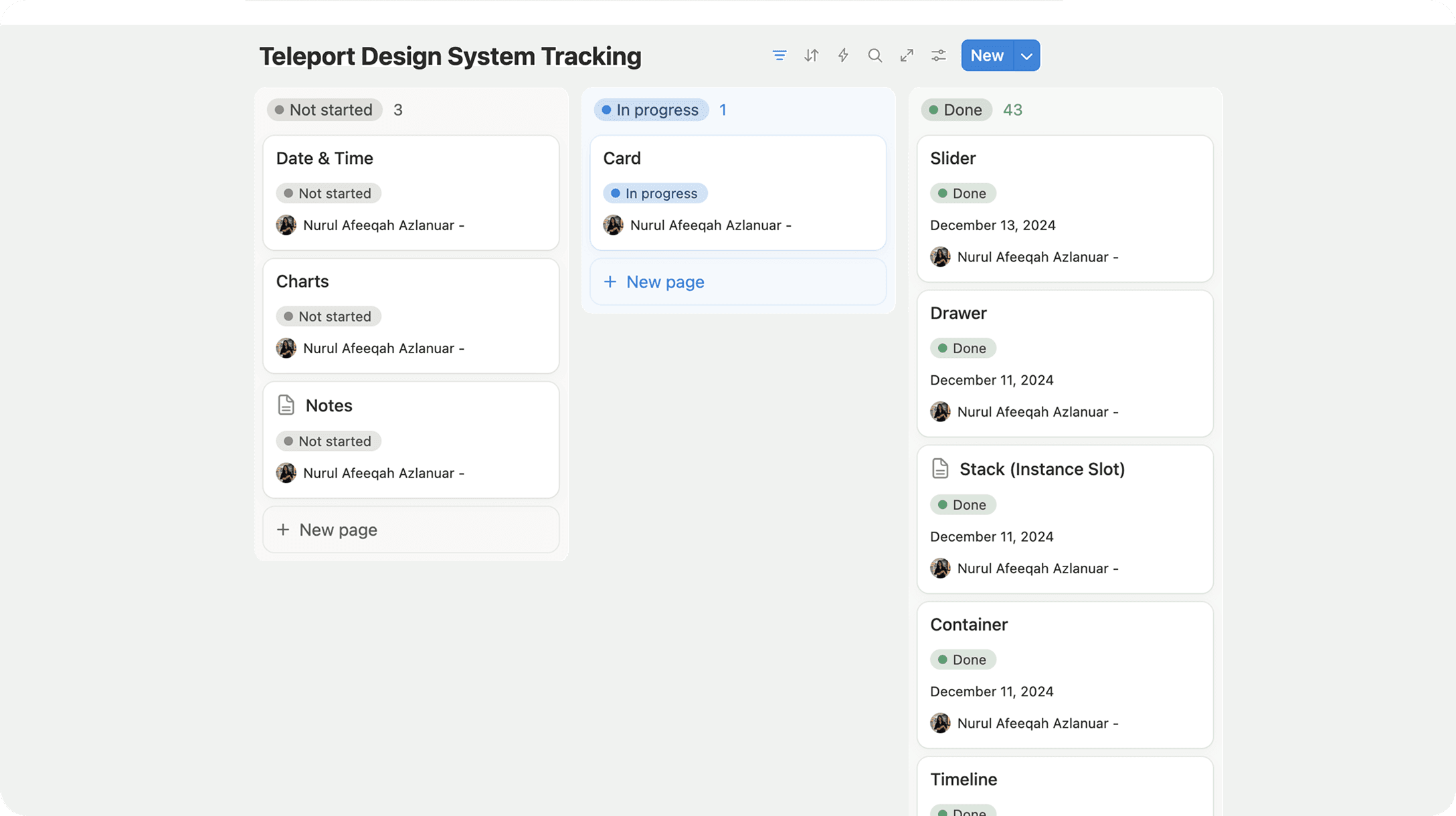
I approached the task by focusing on the component library one by one. I documented and kept track of each components progress using Notion. Our team initially estimated to complete this project within 3 months but we managed to get it done within 2 months and half.
Contributions
How does this design system helps the teams?
Prior completion, we announced and released our design system internally and observed how it helps our team. Beside designers, design system also greatly improve workflows for our developers (mostly front-end developers) and quality assurances.
Designer | Developer | Quality Assurance |
|---|---|---|
|
|
|
Final Outcomes
Overview of the finished library
Lessons
Key Takeaways
Working Smarter with Figma Components Properties
Building this design system helped me better understand and utilize Figma features, especially component properties. It made my workflow more efficient and allowed me to create consistent designs without repeating the same work.
Staying Organized While Building at Scale
Managing 48+ components alongside other projects pushed me to improve my planning and time management skills. It required clear prioritization, consistency, and focus to meet deadlines without compromising quality.