Teleport
2025
Customer Tracking Enhancements
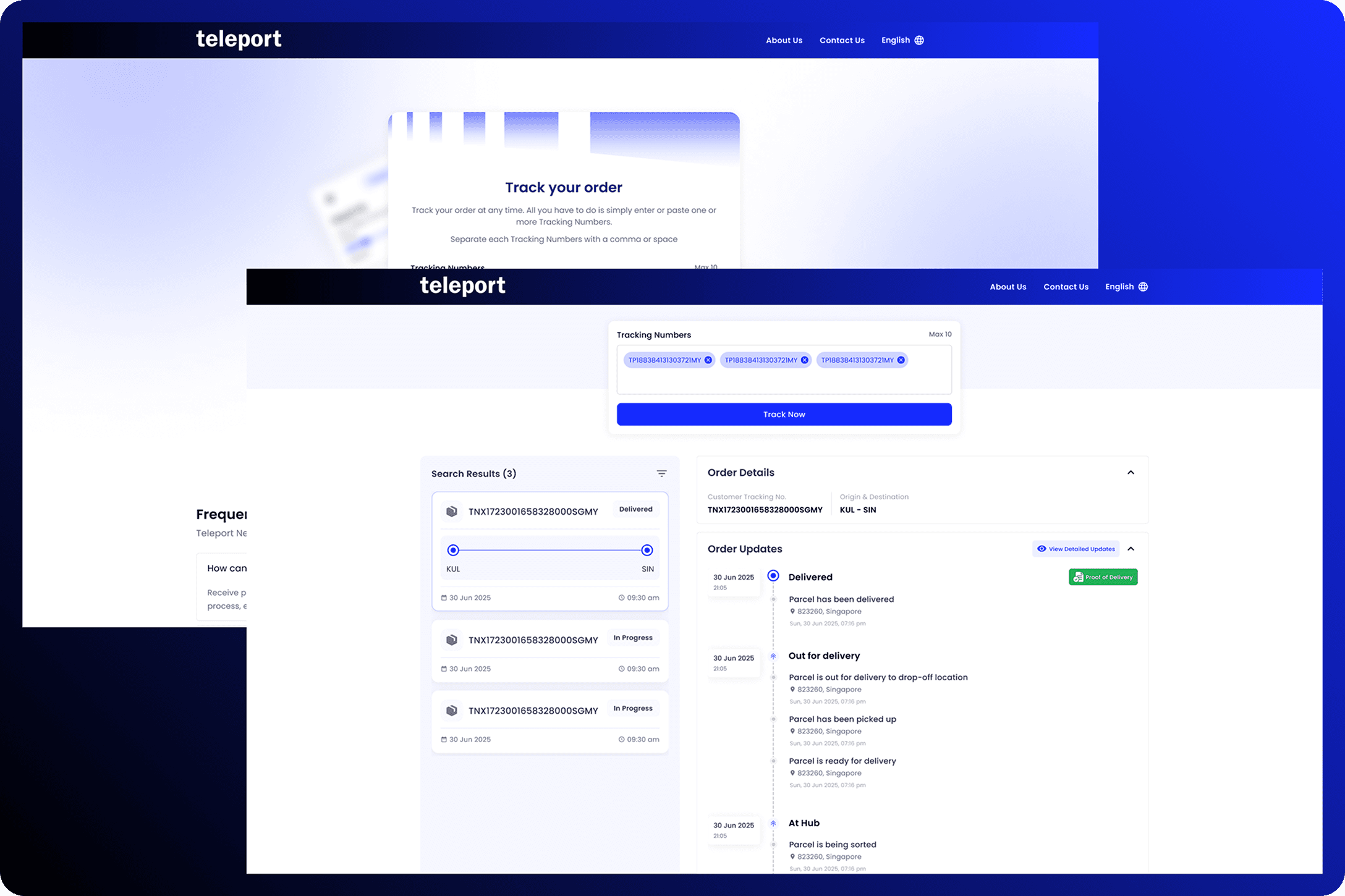
Improvements for the current Teleport customer tracking which covers user experience and user interfaces.
Overview
XX
Customer tracking page is one of the crucial touchpoint for our external users therefore, it is very important for it to be intuitive and visually appealing to create a seamless tracking experience and reduce user frustration.
The current interface is limited to basic tracking, with unclear milestone statuses and an outdated visual design. Our team saw this as an opportunity to enhance the user experience for our customer tracking by providing clarity, usability, and real-time accessibility.
Problem
XX
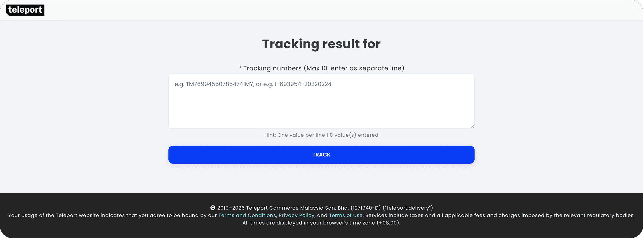
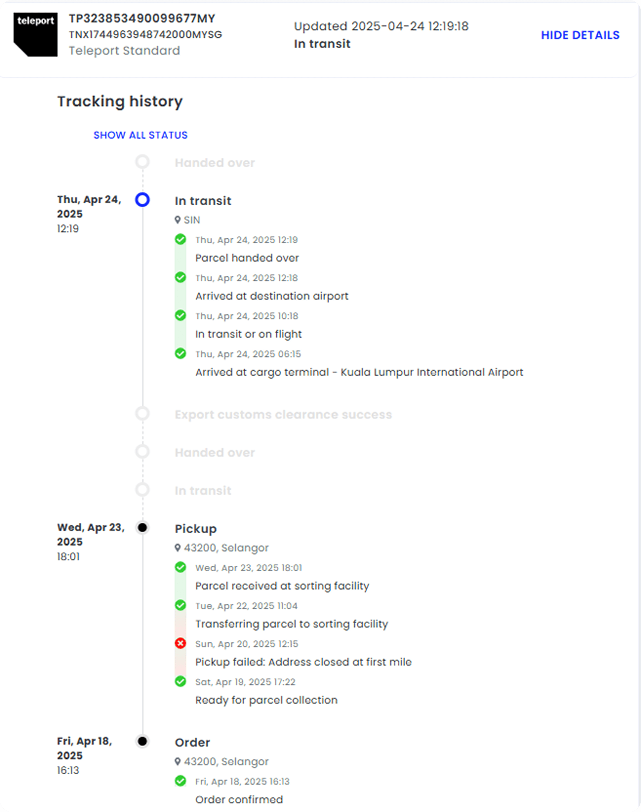
Customers often struggle with tracking their shipments efficiently due to unclear status updates, lack of real-time information, and difficulty in quickly scanning key details. The current tracking page requires manual refreshing and lacks features that enhance usability, such as auto-updates and streamlined navigation. This leads to frustration, especially for users who need quick, hassle-free access to their shipment status.
To improve the experience, the tracking module should prioritize clarity, responsiveness, and ease of use by providing real-time updates, intuitive design, and a more structured presentation of tracking details.
Research
XX
User Research
We began our research by reaching out to the customer care team, as they are closely familiar with user issues and pain points. Through multiple discussions, we also had them gather sample of user scenarios. They mainly highlighted issues like inconsistent statuses between different internal and external systems, the need for clearer communication of how the status being displayed and real-time accuracy.
Delivery Testing & User Flow Diagram
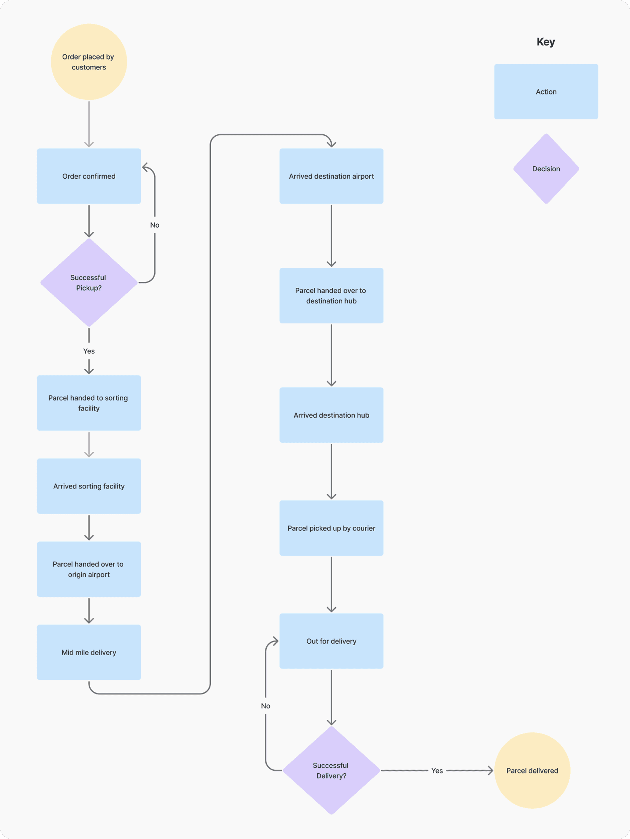
To get clearer a idea of the end-to-end process and how it translate into the current customer tracking page, my team and I did a delivery testing by sending a parcel from Kuala Lumpur to Singapore. We were involved from online order creation in the Teleport Next Day site until our parcel being delivered to our recipient. Every milestones status was recorded and assessed whether the terms being used are relevant from user’s perspectives.
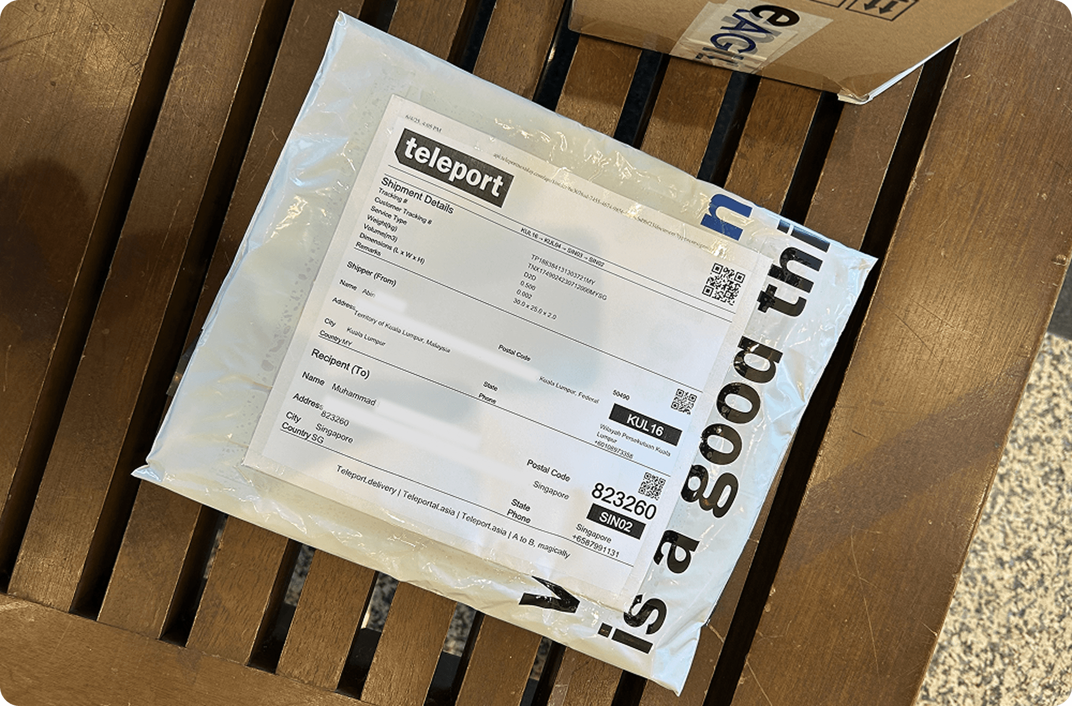
We summarized the whole process into a flow chart diagram for better clarity.
UI Trends
Upon looking into the latest UI trends, we found that many designers showcase layout with 2-3 sections and feature real-time tracking. However, that’s not the case with actual logistic players in the industry. Most logistics players such as Shopee Express, DHL, Flash and FedEx still prioritizes simple and straightforward UI so users can quickly scan for the expected arrival date and check on the current status of the parcels.

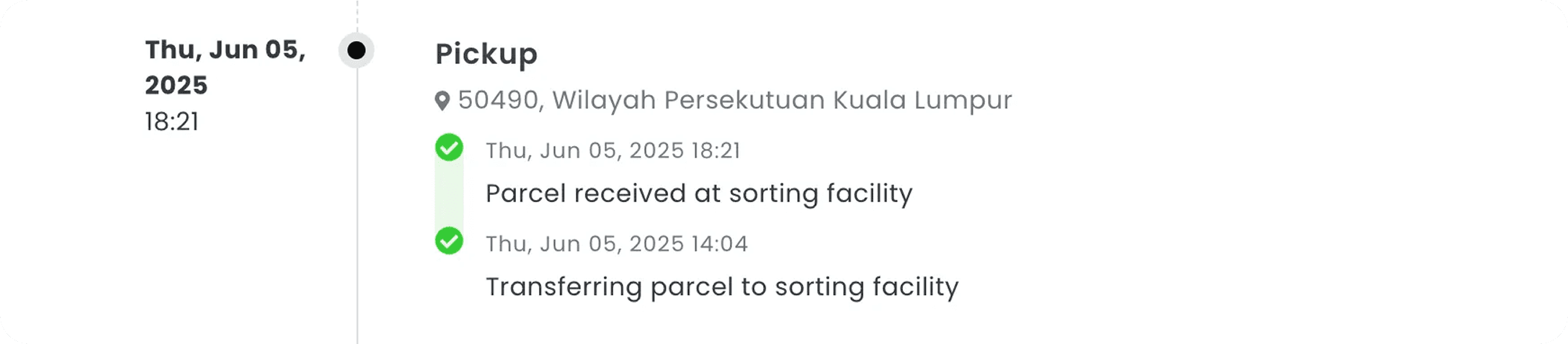
We also compared the terms used by the logistic players – we found that the status updates should use plain language and jargon-free that’s easy for users to understand. For example in our case, we need to simplify ‘Parcel received at sorting facility’ and ‘Transferring parcel to sorting facility’ into ‘Your parcel has arrived our hub and sorted’.
Competitive Analysis & Tracking Status Improvements
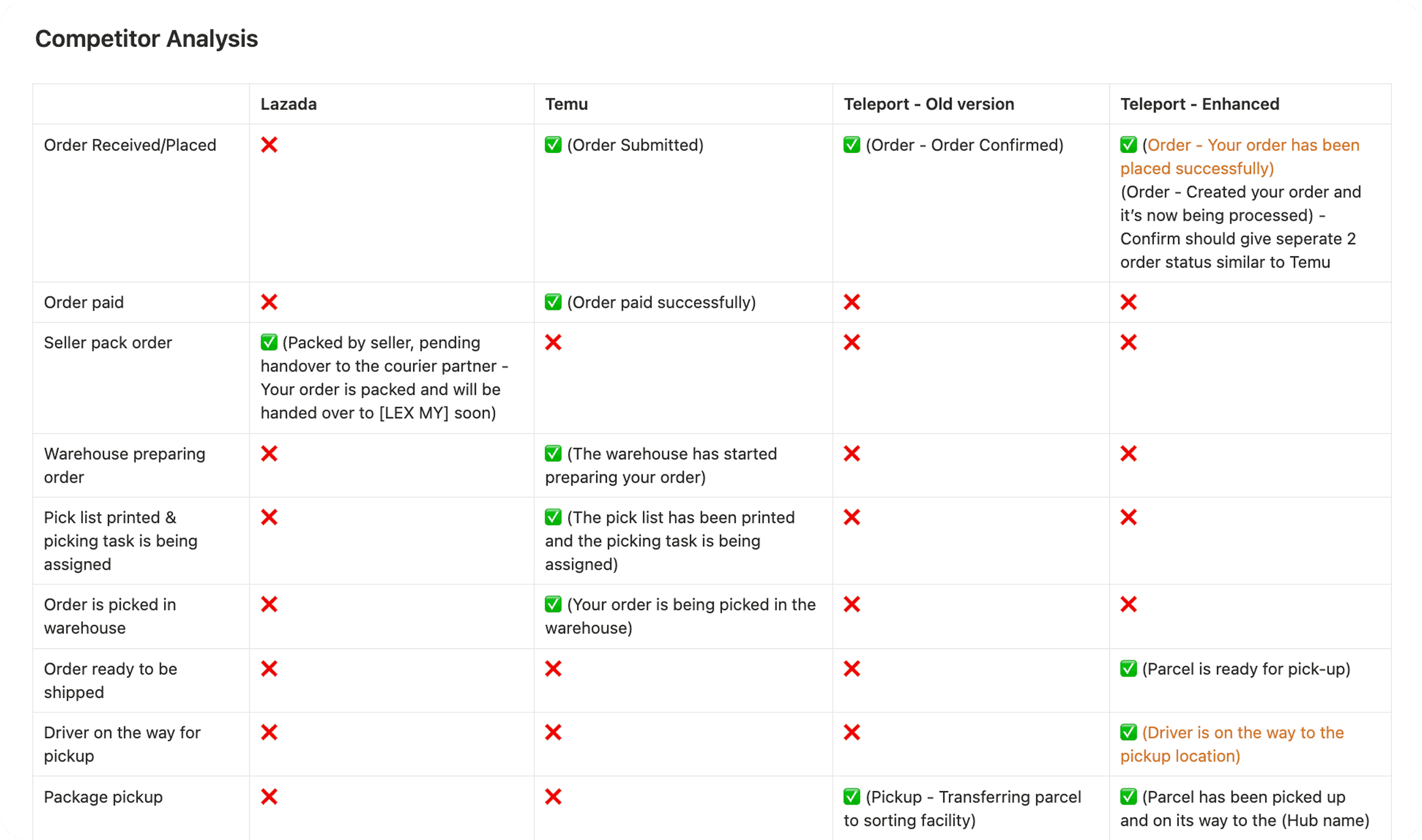
We created a competitive analysis table to compare tracking statuses between Lazada, Temu, and Teleport. By recording the milestone wordings and terms used by each platform, we were able to understand common patterns and use these insights to improve our tracking statuses.
Conclusion
Based on our researches, we can conclude that:
We need to replace any irrelevant status or terms used and come up with clearer wordings.
The status or terms used between products should be consistent and aligned with one another.
Statuses should be defined based on operational feasibility – ensuring each one is relevant and can be actively updated by personnel, while removing those that cannot be triggered in actual workflows.
Real-time tracking would greatly distinct us among other players however it was not yet feasible so we put that as out of scope for now.
We can adopt modern UI trends by using multiple layout views for a cleaner interface.
Design Process
XX
Ideation & Wireframes
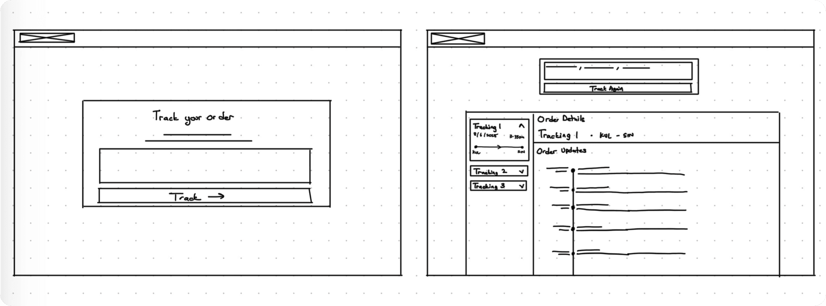
During the ideation phase, we decided on a double-column layout for the search results. This approach effectively utilizes white space while allowing users to view multiple tracking numbers at a glance. Placing the switching cards on the left also makes it easier for users to navigate between results within a single search.
Final Outcomes
XX
Lessons
Key Takeaways
Aligning Terminology Across Teams
Customers and operations teams often used different terminology to describe the same tracking statuses, leading to inconsistencies across platforms. This highlighted the importance of standardizing language while designing solutions that remain intuitive and understandable for both user groups.
Bridging Communication Gaps Between Stakeholders
Acting as the middle person between stakeholders can be challenging, especially when there are differences in terminology or levels of understanding. It reinforced the importance of clearly translating their needs while also making sure our solutions are communicated in a way that’s easy for everyone to understand.

